After learning about both Photoshop and Illustrator, we will do a final task for each program. This task is to show your knowledge of making a logo and using Adobe Illustrator.
(We will have a separate task for Photoshop afterwards)
Now, we have contest where the winner will receive a free canoe trip this summer!!
The Brant Youth Wellness Coalition is looking to have a logo developed for our summer “CaNEW Friends on the Grand” canoe trip. This trip will see 50 youth from Brantford and Brant county and 20 youth from New Credit/Six Nations paired with 70 social/justice community partners ie. Justices, police, lawyers, probation.
We need a logo which is transferable to T-shirts and any advertising we do.
For your Fete de Folk logos, many of you made posters, rather than logos. Let's talk about what a LOGO is...
lo·go
ˈlōɡō/
noun
- a symbol or other design adopted by an organization to identify its products, uniform, vehicles, etc.
You may also think of a Logo as a simple visual mark to identify your company product or service.
Now days, the most popular and successful companies continue to say that "simpler is better", especially today when everything is moving so fast you have less and less time to impress your customers. So it has to be done in a very stylish manner yet remaining conservative so that it`s easier for the eye to catch and the brain to memorize your logo design.
These days you also have to consider the reproduction cost. More detailed and colorful logo designs are harder to reproduce and they of course cost more. You also have to consider the size that your logo is going to be used at. The perfect logo design will look great on a sign board as well as on a business card or on a pen for example.
Let's talk about each kind separately. Iconic Logos can be very different. The classic variation is to make the symbol fit any of the basic geometrical shapes. For example:
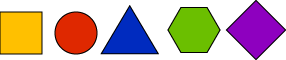 The best shapes to use are symmetrical geometrical shapes They can be placed almost anywhere and still maintain the balance; they are very easy to handle.
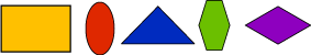 It is still good to make the logo fit any kind of geometrical shape, it looks more fit and balanced:
 And at last there is no obligation in what kind of shape to use , you can use any free form shape you want, but you have to be very careful with the placement, so the logo doesn't look like it is falling apart or going to fall.
•You may come up with an image related to a business like a house for a real estate company, or a car for a car dealership
•You could use just an abstract image representing the company`s philosophy. For example some kind of blocky image would suit a stable trustful company or even just a pyramid. A very dynamic image with orbits and swooshes, sparks, particles could be used for a very modern, young, high-tech company to represent electrical activities or just cutting edge meteoritic technology.
When you come up with an image for your company you should already be thinking about the best way to advertise your company towards the targeted audience. Your logo should not just not just be noticeable and memorable, but should also be easy accepted by the market.
What kind of feeling does a logo transmit just by standing alone and in a crowd? Too many sharp edges can create a feeling of danger or caution. Also consider your colors, so the logo design looks noticeable but not too intimidating.
You can use any style of art style for a logo as long as it is unique, easily reproducible, and is suitable for your market.
https://www.logobee.com/feature3.htm
These days you also have to consider the reproduction cost. More detailed and colorful logo designs are harder to reproduce and they of course cost more. You also have to consider the size that your logo is going to be used at. The perfect logo design will look great on a sign board as well as on a business card or on a pen for example.
Let's talk about each kind separately. Iconic Logos can be very different. The classic variation is to make the symbol fit any of the basic geometrical shapes. For example:
Selecting the concept
Now the most important part is to get the concept for a logo. It is almost the same process as selecting the name. First you have to determine what your logo should say about your company. There are many different ways to represent a company.•You may come up with an image related to a business like a house for a real estate company, or a car for a car dealership
•You could use just an abstract image representing the company`s philosophy. For example some kind of blocky image would suit a stable trustful company or even just a pyramid. A very dynamic image with orbits and swooshes, sparks, particles could be used for a very modern, young, high-tech company to represent electrical activities or just cutting edge meteoritic technology.
When you come up with an image for your company you should already be thinking about the best way to advertise your company towards the targeted audience. Your logo should not just not just be noticeable and memorable, but should also be easy accepted by the market.
What kind of feeling does a logo transmit just by standing alone and in a crowd? Too many sharp edges can create a feeling of danger or caution. Also consider your colors, so the logo design looks noticeable but not too intimidating.
You can use any style of art style for a logo as long as it is unique, easily reproducible, and is suitable for your market.
https://www.logobee.com/feature3.htm
WHEW!!! LOTTA READING!! Play this game now to give your brain a rest while looking at some popular and well-marketed logos!!
Now, start thinking about your logo.
You will use Adobe Illustrator to create a logo. Use what you learned about making shapes as well.
Make sure that your image is your OWN. Don't use images found online (that's visual plagiarism).
Start with a shape and then fill it in with text.
***If you are finished early, take your exported logo into Photoshop and put some filters on it!***
***If you are finished early, take your exported logo into Photoshop and put some filters on it!***
Produce THREE proto-types that are all different.
Refine the best one and then we will submit it for the contest! If you would not like to submit it to the contest, just let me know. GOOD LUCK!!
Mission Statement
The mission of the Brantford Police Service is: "To enhance the quality of life for all citizens and respond to their changing needs by ensuring and promoting public safety in partnership with our community."
Values Statement
The RIGHTS of all persons as enshrined in the Charter of Rights and Freedoms. The RESPONSIBILITY of all persons to abide by the laws of Canada. In a proactive PARTNERSHIP with the community in an effort to promote mutual respect and responsibility. Being FAIR, UNBIASED and treating all persons with RESPECT and DIGNITY. SAFETY through the protection of persons, property and our environment. Respect for the value of our HUMAN RESOURCES and a COMMITMENT to their continuous development. The highest possible degree of personal and professional INTEGRITY in the performance of duties. Ongoing, open COMMUNICATION with our community and within the Service. Being ACCOUNTABLE in providing HIGH QUALITY police service to our community.
No comments:
Post a Comment